UX
Research


Applied qualitative & quantitative insights to drive strategic, user-centered design solutions that enhance product experiences and business outcomes
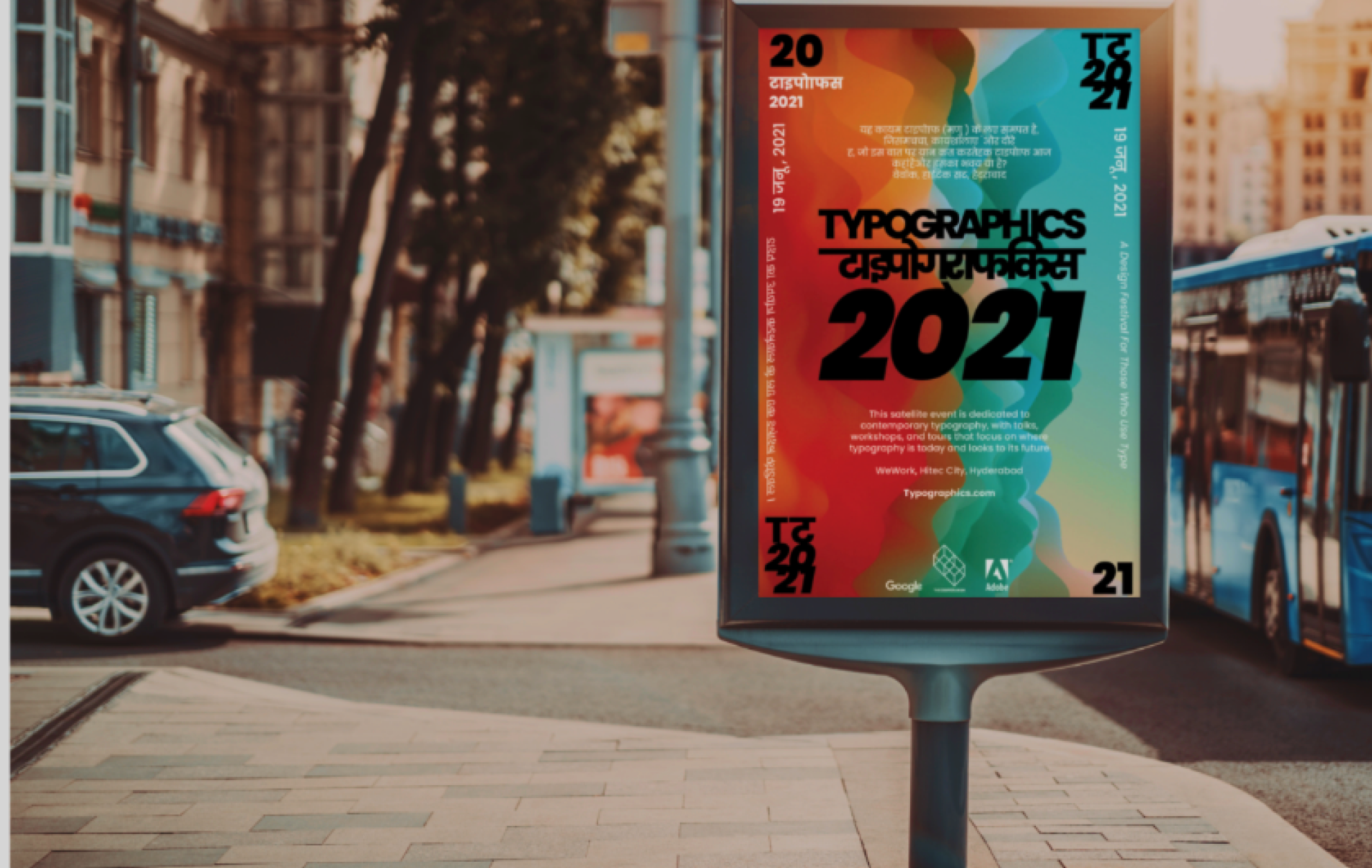
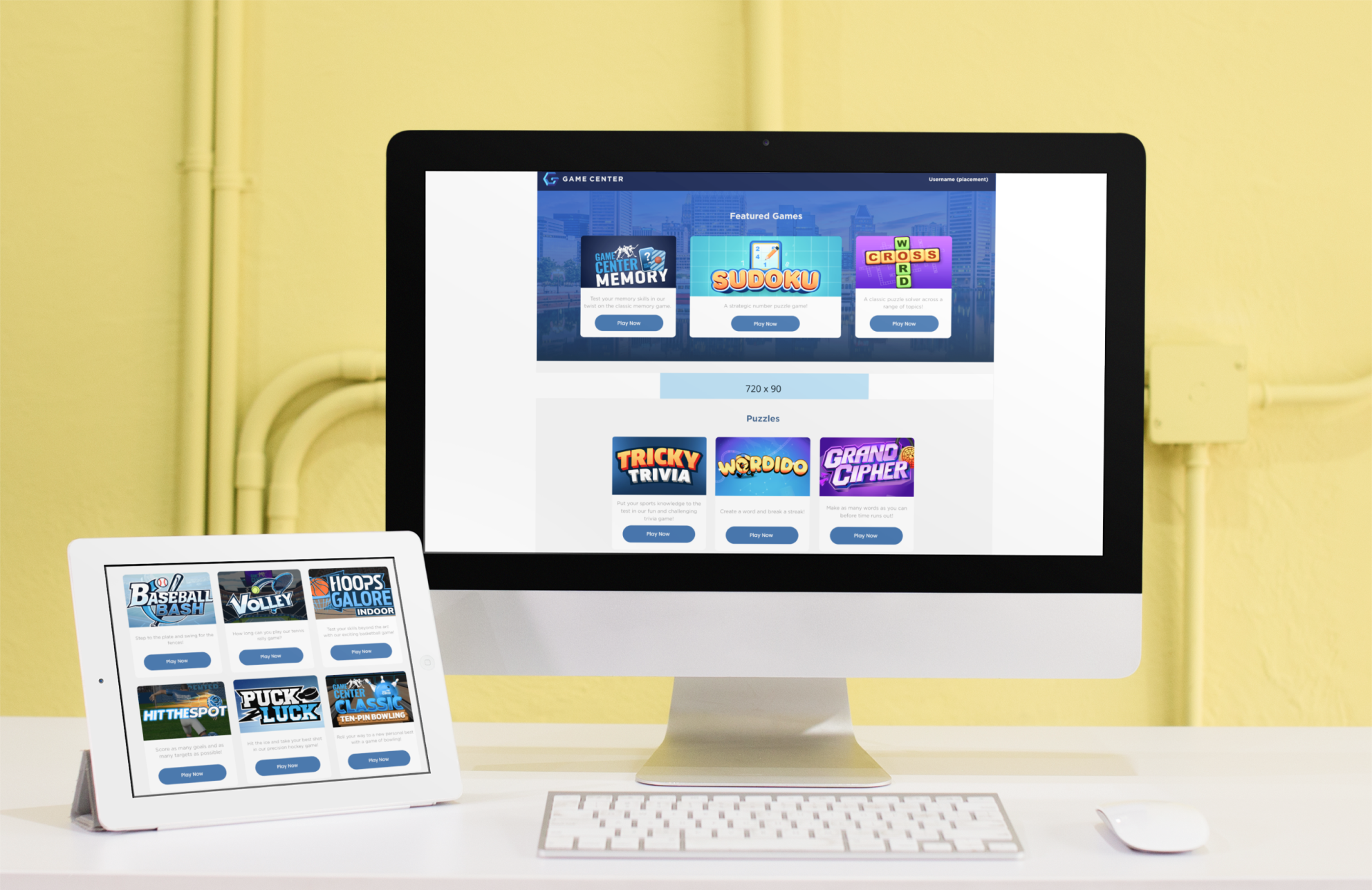
Peacock Survey
What features in a streaming app do users prefer?
Users voiced their opinions through the results of this survey that evaluated how they felt about the newly released free Peacock streaming site. There were 12 participants ranging from 25-65 years old, male and female.
The following questions were asked:
- Q1: What layout do users prefer while streaming?
- Q2: How do moviegoers feel about the premium tabs that restrict their current selections.
- Q3: Do users like having Rotten Tomato ratings or do they prefer to make their own judgments on films?
- Q4: Do users care about trending news?
- Q5: How do users feel about film icons that show clips of film while scrolling.
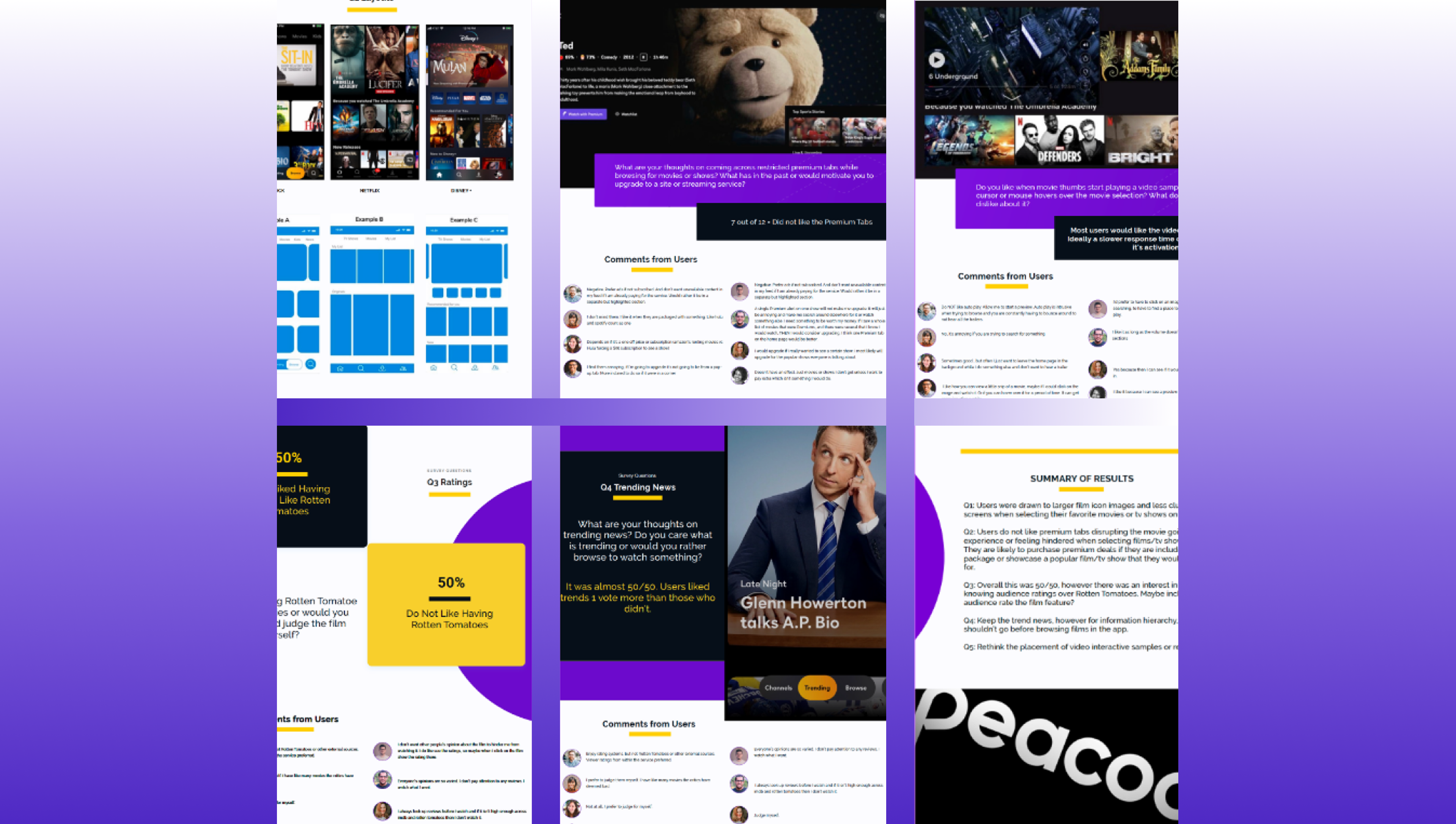
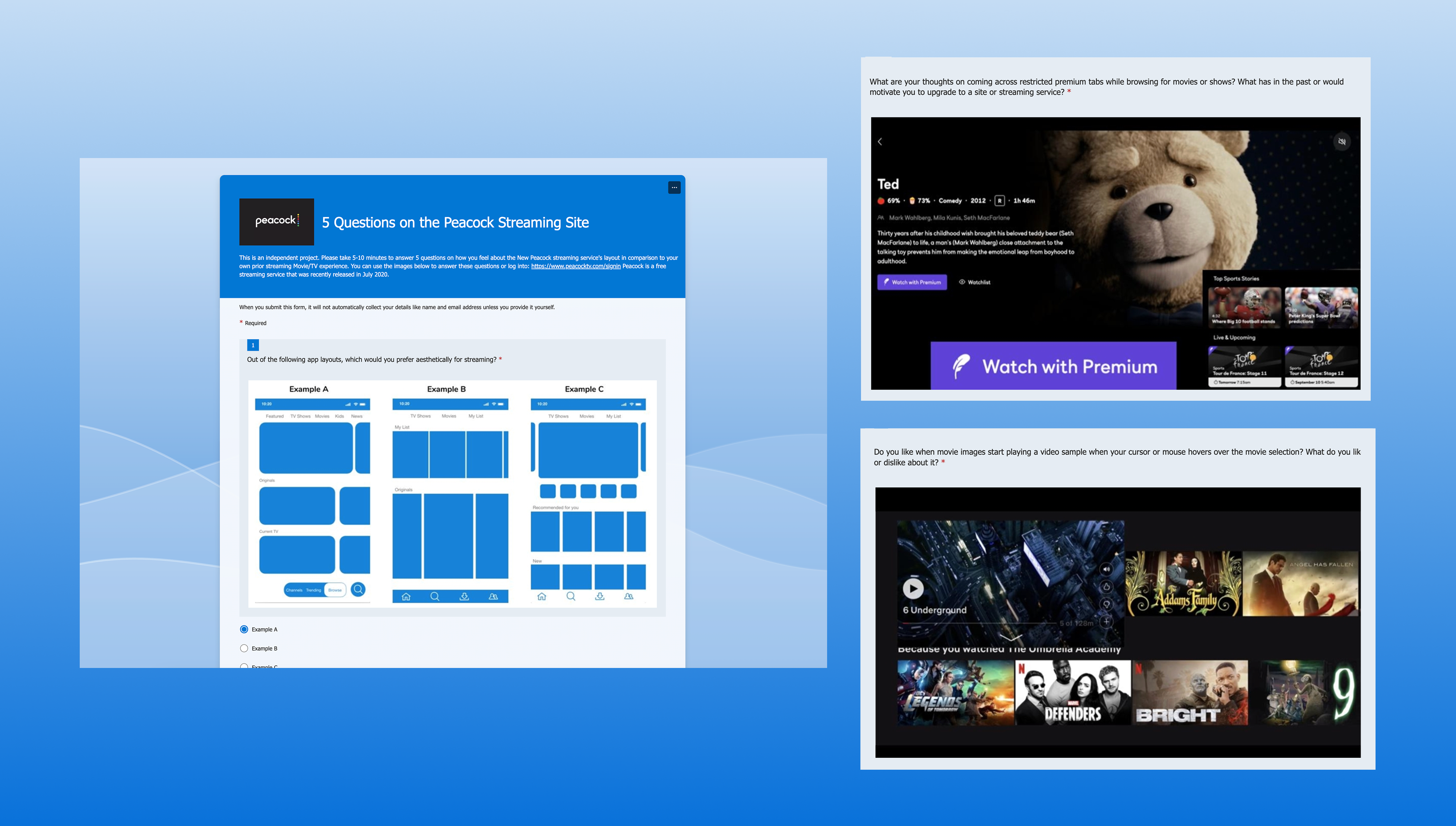
Results Summary:
- Q1: Users were drawn to larger film icon images and less cluttered screens when selecting their favorite movies or tv shows on an app.
- Q2: Users do not like premium tabs disrupting the movie-going experience or feeling hindered when selecting films and tv shows. They are likely to purchase premium deals if they are included in a package or showcase a popular feature they would pay for.
- Q3: Overall this was 50/50. Comments showed that users like to know what audiences think about films over professional critic reviews.
- Q4: Keep the trend news, however for information hierarchy, this shouldn’t go before browsing films in the app.
- Q5: Rethink the placement of video interactive samples.
UX Boston Resaerch
Project Summary
The User Experience Professionals Association’s Boston Chapter is a nonprofit organization that provides a forum for usability practitioners to share techniques and experiences. For this project, I was asked to review their site layout and functionality and provide solutions for the problems found during its evaluation. I worked with a team on this project and the results went to the UXPA stakeholders
Discovery
The site was evaluated using UX design heuristics on what was working and didn’t work on the website. Different User scenarios were created to approach the site from different perspectives and to ensure that the site was meeting its users’ needs and giving opportunities to their target audience from different professions and backgrounds within the UX field. After the evaluation, a report was made explaining the findings. On the surface, the site performed well offering a professional layout, solid information architecture, fresh content, and user-friendly animation. The foundation of the site, however, was where the website had its issues. Links didn’t work properly, information was outdated, the alignments were off, all of which took away from the professionalism of the site and what it represented.
Heuristics:
- Links were sending users to backdoor sites.
- Slack links were outdated.
- The breadcrumb sublinks did not work.
- The internship page contained outdated information, and the photo gallery lacked user-friendly navigation.
- Buttons were not working properly.
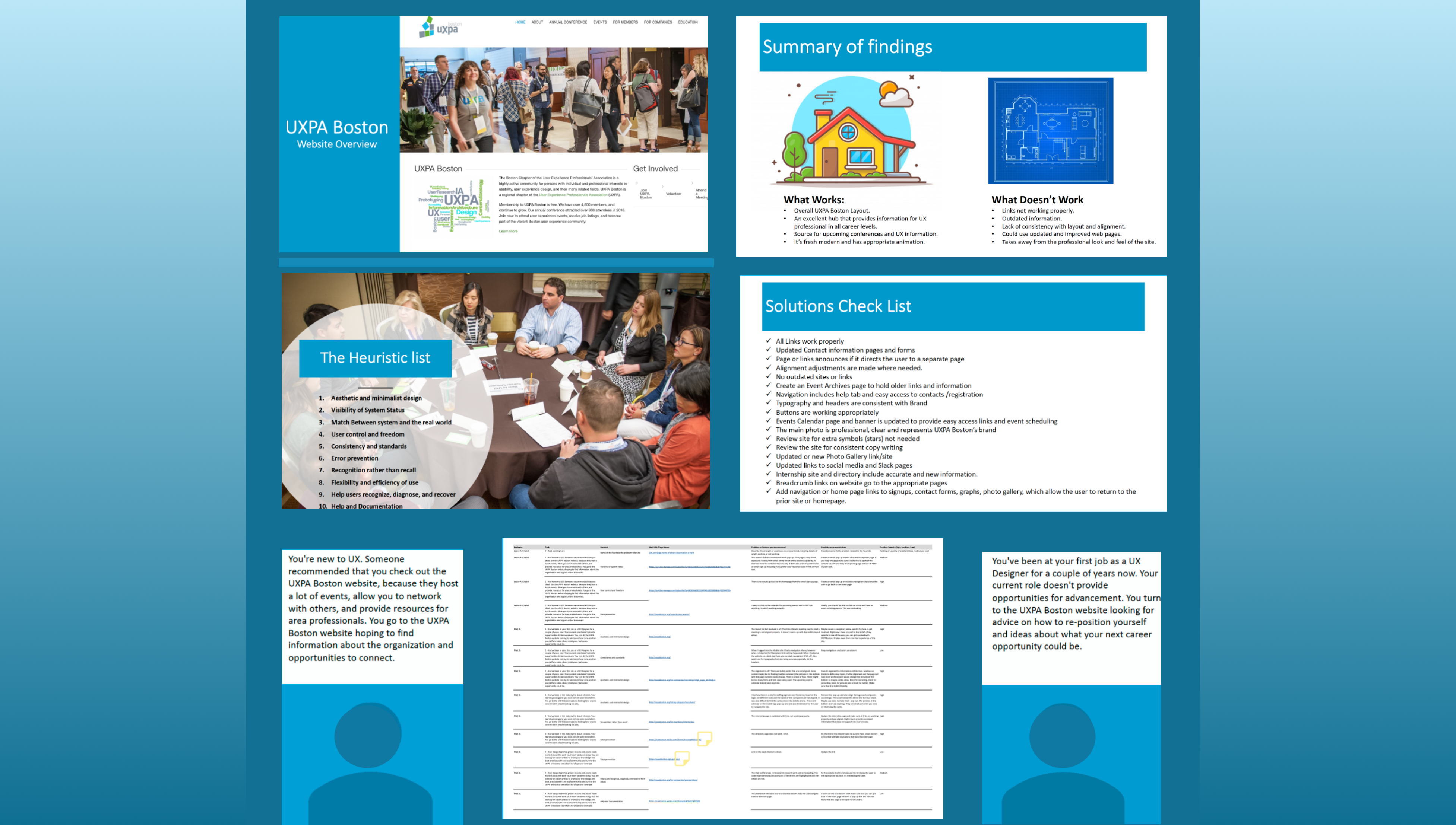
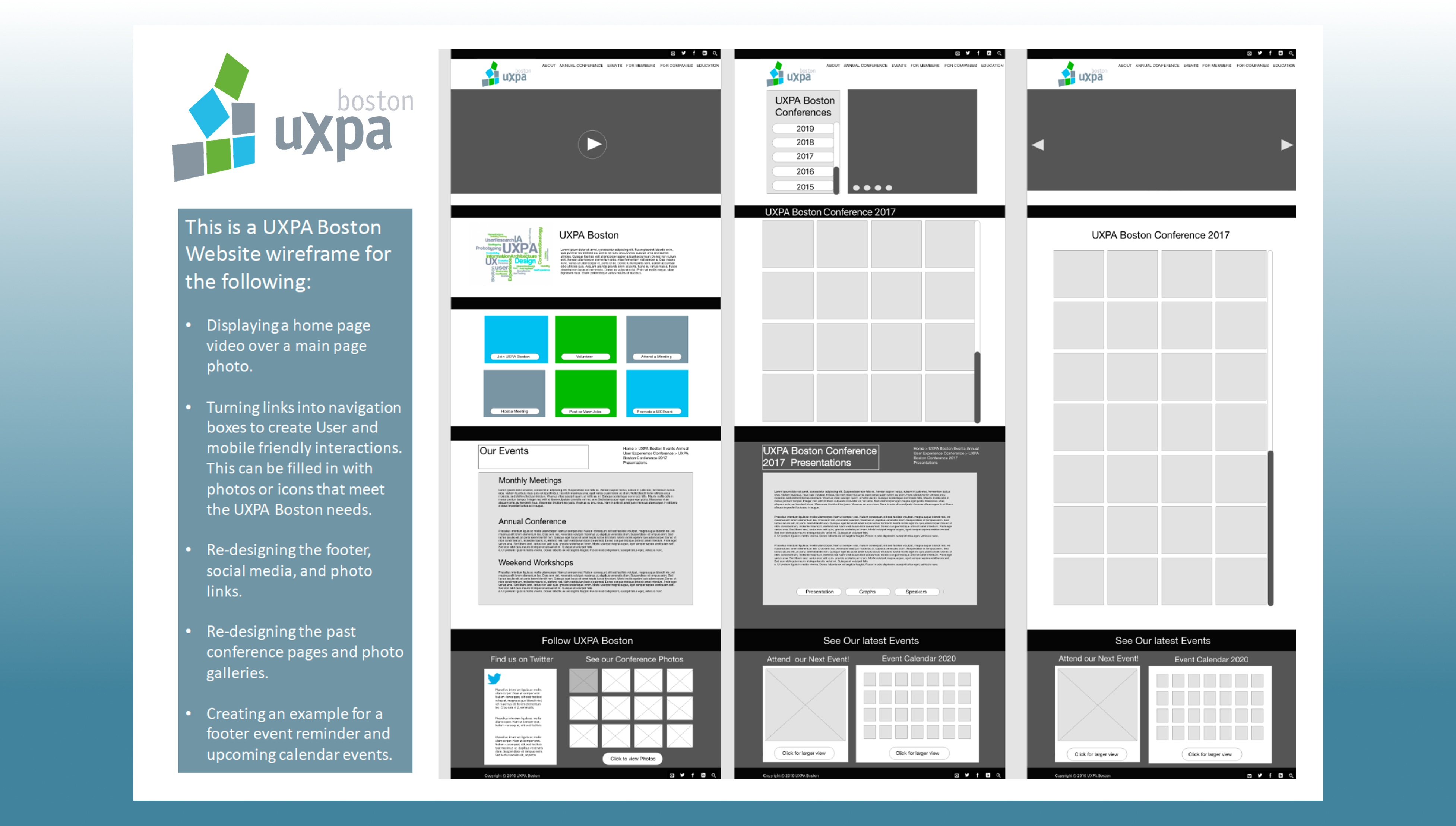
Building the Wirframe
Lastly, I created a wireframe to highlight opportunities for improving the site’s structure. In the original design, a small footer thumbnail linked out to a Flickr page. I recommended replacing this with a dedicated archives page that highlights past images and event details, supported by three clear buttons linking to previous presentations, graphs, and speaker information. I also reorganized the social media section by placing the Twitter (X) feed on a clean white background, improving both visibility and overall cohesion instead of leaving it isolated at the bottom of the page.
Results
I created a solutions checklist outlining the key improvements identified during the site evaluation, along with wireframe recommendations. These findings were later presented to stakeholders for review and feedback.
Frangrance Study
How to conduct UX research on a new fragrance subscription service.
Different research methods were applied during the development phase of a Fragrance subscription service utilizing qualitative and quantitative testing to validate the product and gain insight into its users and customers.
Project Goals:
- Conduct the developmental process of UX research for a perfume subscription service.
- Develop a Customer Discovery Interview and Empathy Map based on insights from 20 participants.
- User test a high-fidelity wireframe.
- Establish a journey map of findings from the testing.
- Create user personas.
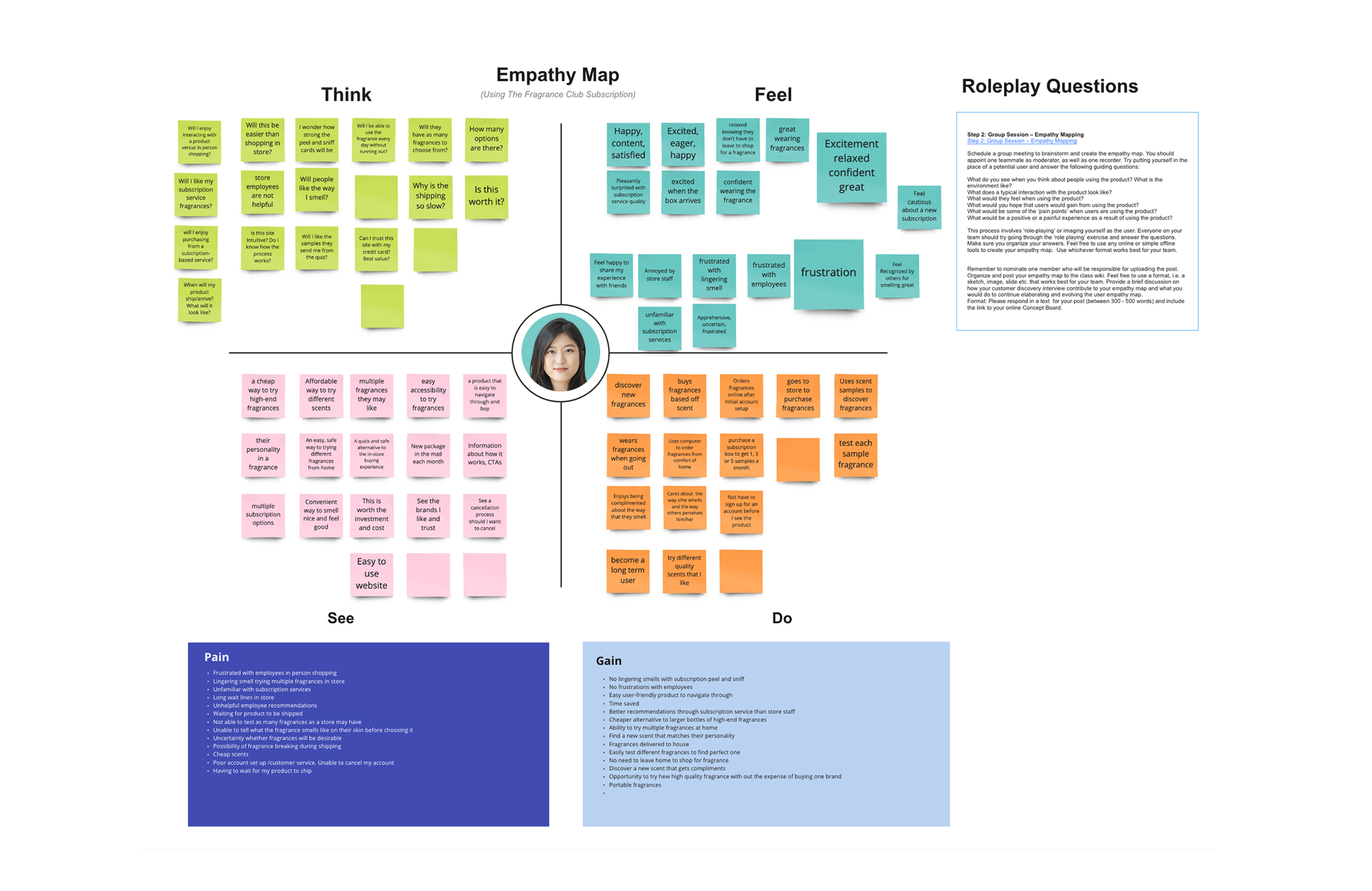
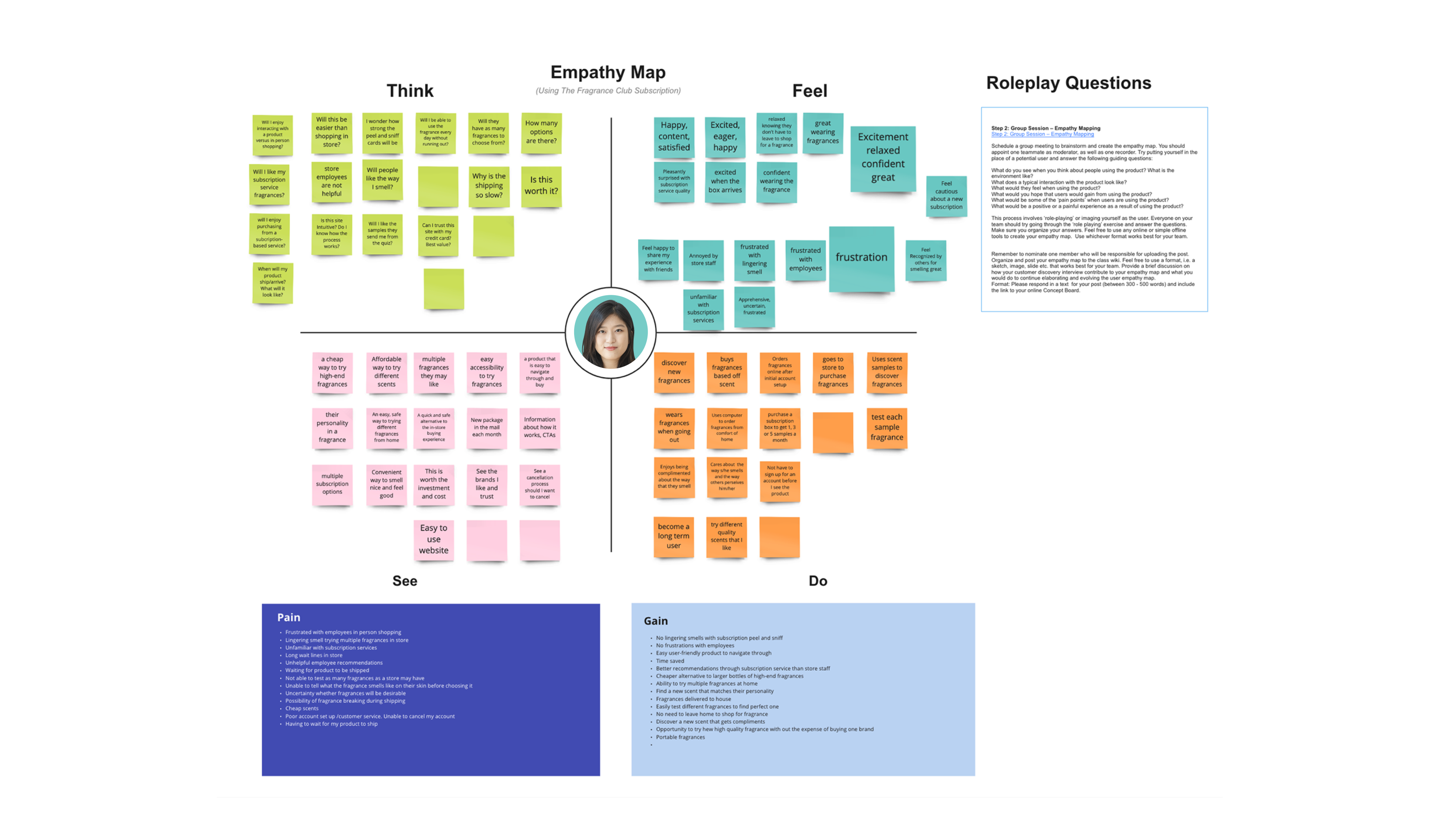
Empathy Map
Taking the results from the customer discovery interview, we asked the participants questions related to their daily fragrance usage along with their shopping spending experiences. An empathy map was created with split quadrants on how the user may think, feel, see and do. The data was broken down into pain points from what the consumer has experienced in the past using similar products and subscription services.
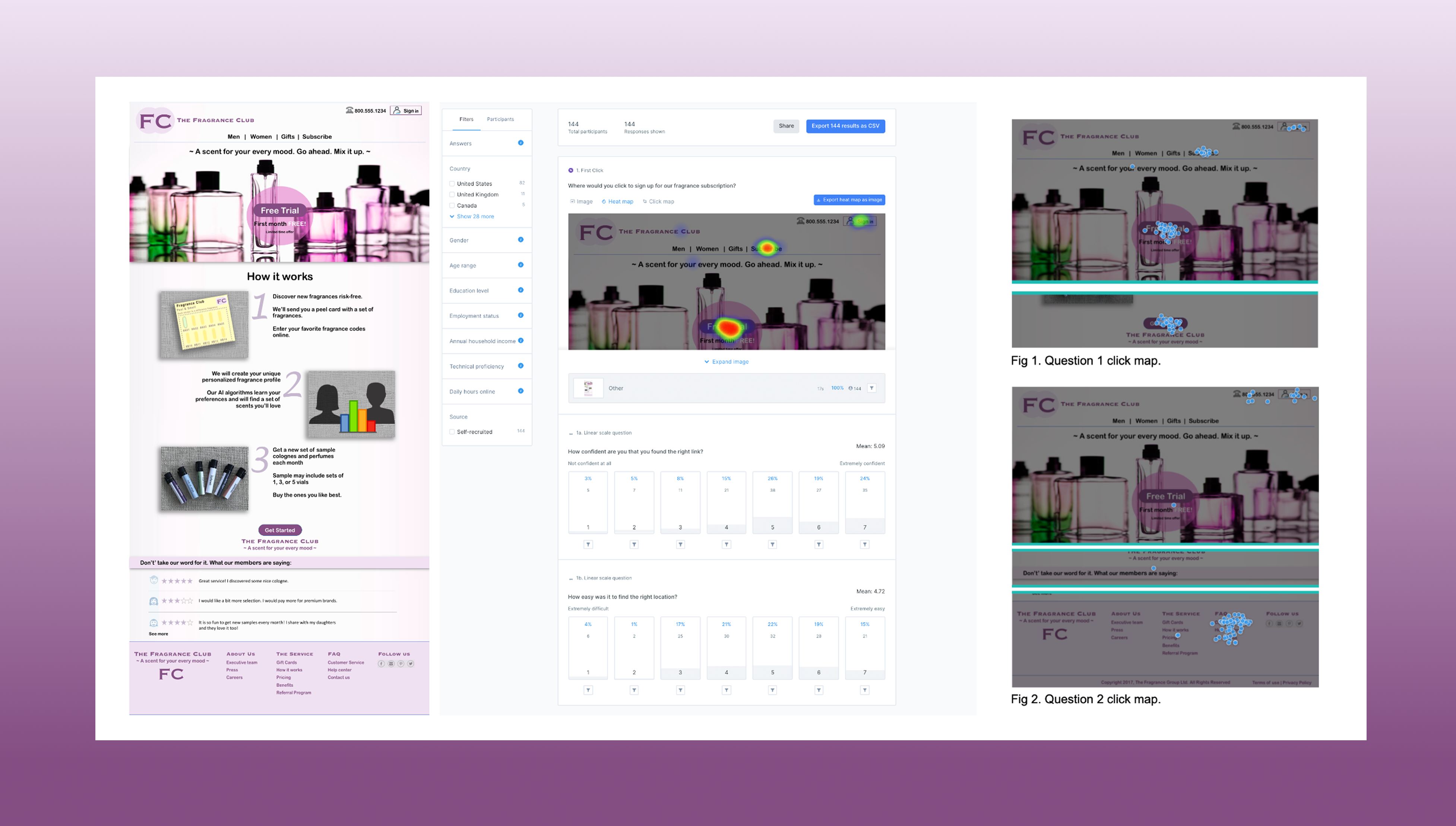
Usability Testing:
Our team conducted the Usability test on a mock high-fidelity wireframe. There was a focus on information hierarchy and how the user navigates the Fragrance Club site. This test determined if this subscription service could provide users with what they needed. This information helped gauge how the business could create a better user experience and product. Overall the test was successful as we had 144 participants. Looking at the heat map we could see how important information hierarchy played in allowing the user to navigate the site. The test allowed us to see if they understood the subscription service and helped the business discover what price points their target markets were in.
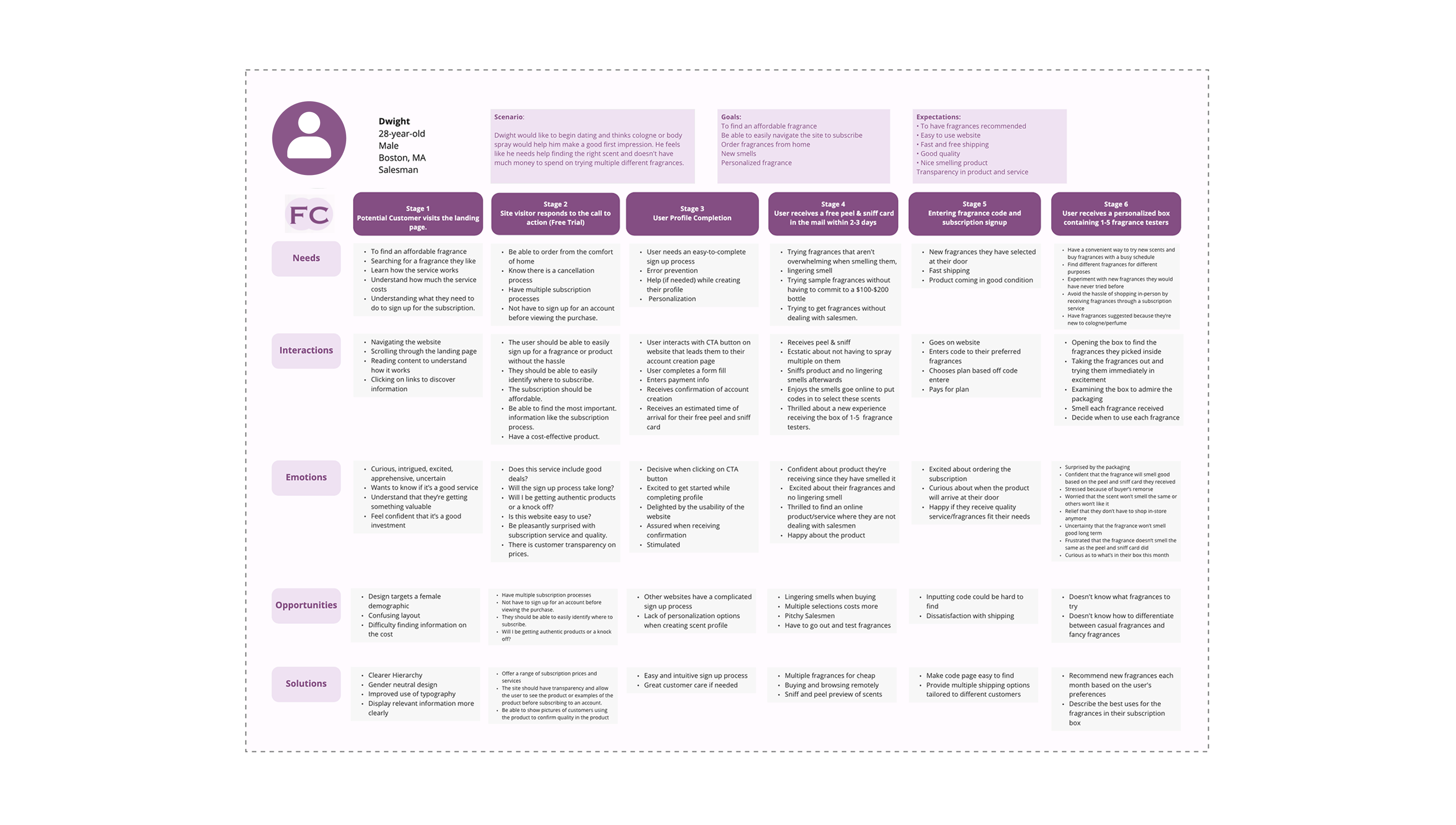
Journey Map:
The data taken from the Usability test allowed us to visualize the series of interactions that the user would take with this product. Working with a team we developed six journey stages our user would take:
- A potential customer visits the landing page.
- The site visitor responds to the call to action.
- The user completes their profile.
- The user receives a free sample of a peel-and-sniff card in the mail within 2–3 days.
- The free sample includes a promo code for subscribers.
- The new subscriber receives a personalized box containing 1–5 free samples as part of their subscription.
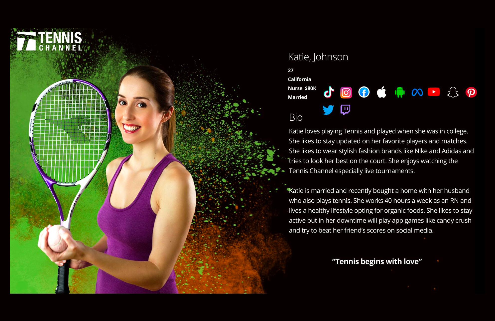
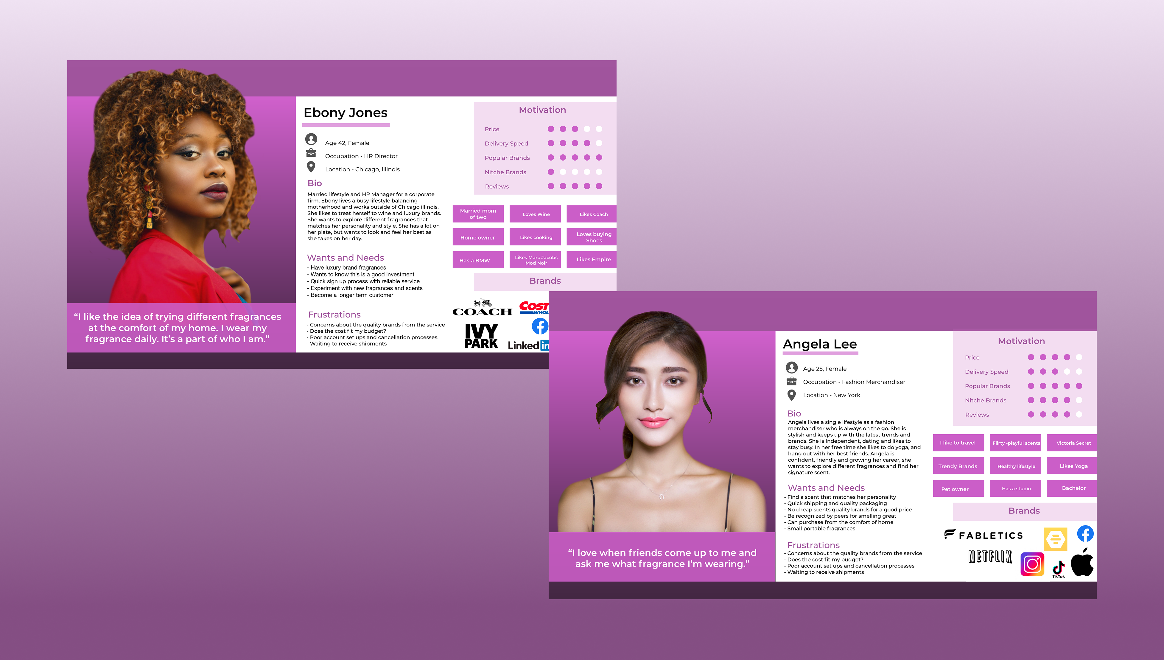
Personas:
The final stage of the UX research discovery process focused on developing personas. By analyzing all collected data, we identified the target users for the Fragrance Club subscription service. The demographic ranged from individuals in their 20s to 40s, with professional backgrounds drawn directly from the results of our testing.
Project Summary
As a team, we identified several key opportunities for improvement within the Fragrance Club. While the service includes male colognes, the overall branding does little to engage or appeal to male users. Our research also revealed that the product currently provides only paper fragrance samples, whereas competitors offer more appealing small-bottle testers. In addition, the mock wireframe required refinements to improve navigation and support users in completing their tasks more effectively. This project highlights the research methods applied to evaluate and enhance the Fragrance Club experience.