Client
How can telecommunications services be improved for their users?
UX research was conducted to improve a mobile business experience based on in-person interviews with various telecommunications companies including Sprint, At&T, and Verizon. In response to the findings a mobile support app prototype was created to exemplify what represents a positive telecom experience.
Project Goals:
- Problem solves an in-person interview on different telecom services.
- Develop research solutions using empathy maps, job stories, and ideation.
- Using the provided research develop wireframes and prototypes to be user tested.
- Report results and outcomes.
User Research
Discovery:
Recordings from customer interviews were used to conduct observations on the customer’s interaction with their telecom experience.
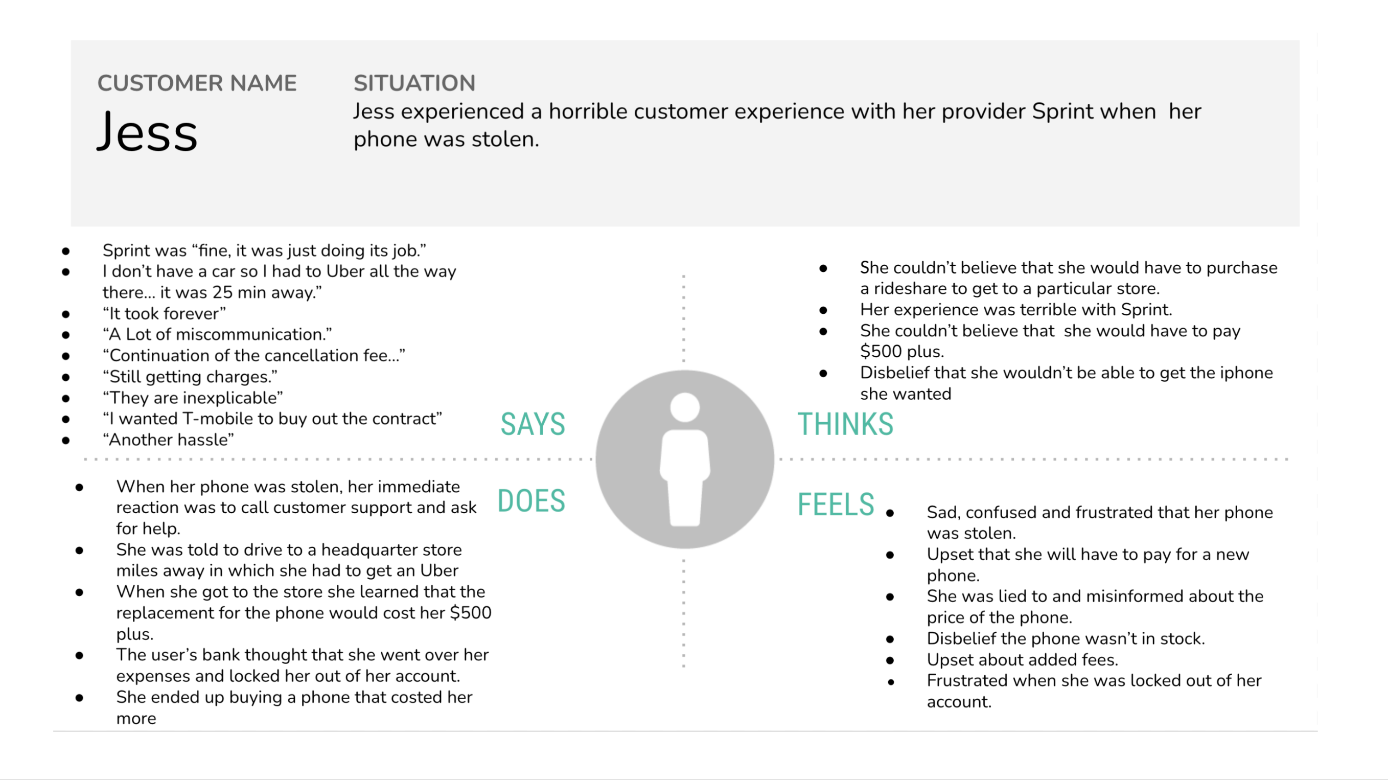
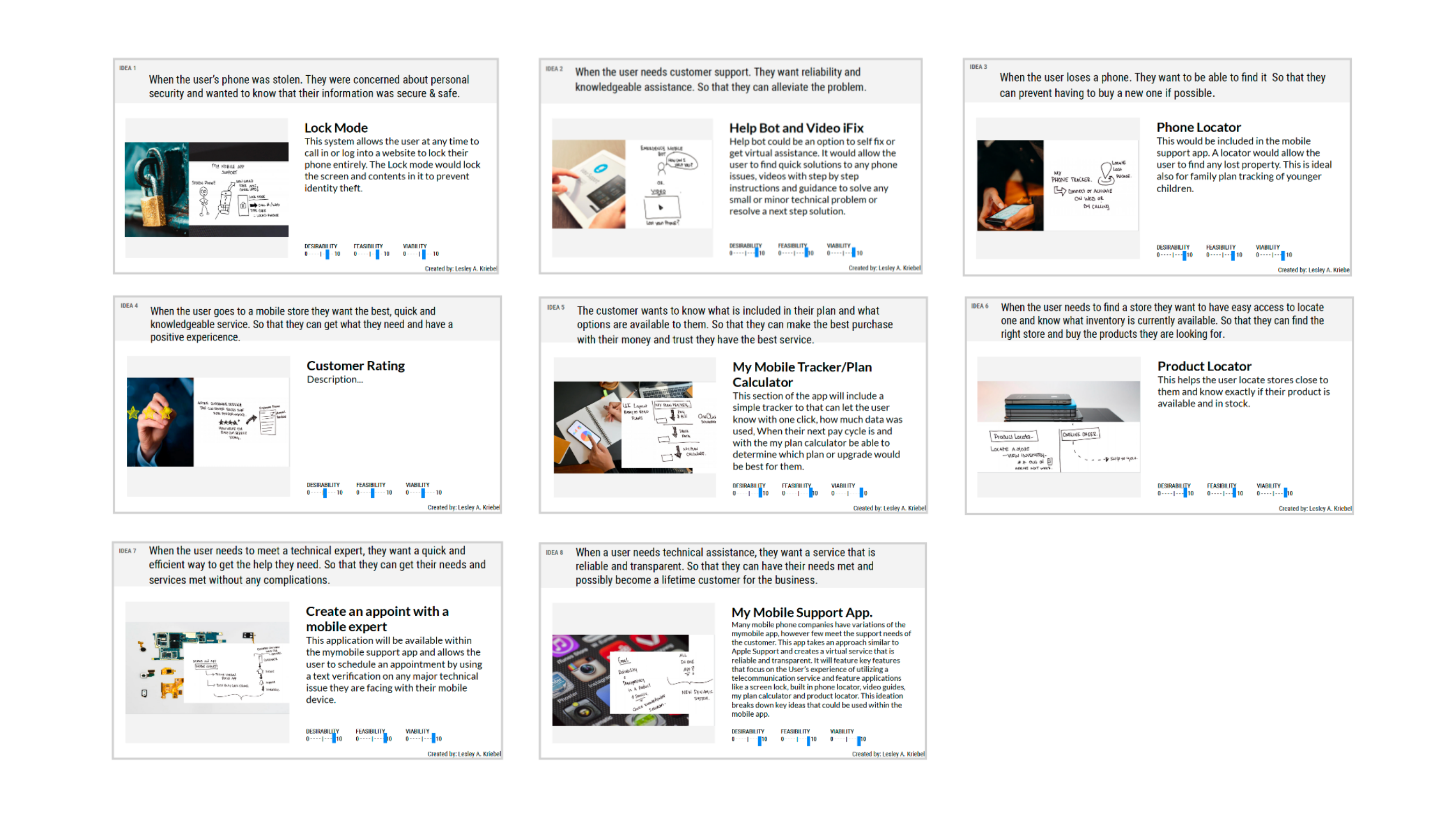
Empathy maps were created to gauge a further understanding of the user and how they felt about the service and pinpoint possible problem-solving solutions. Job stories and ideated concepts were then formulated and discussed among team members in a scrum.
Define:
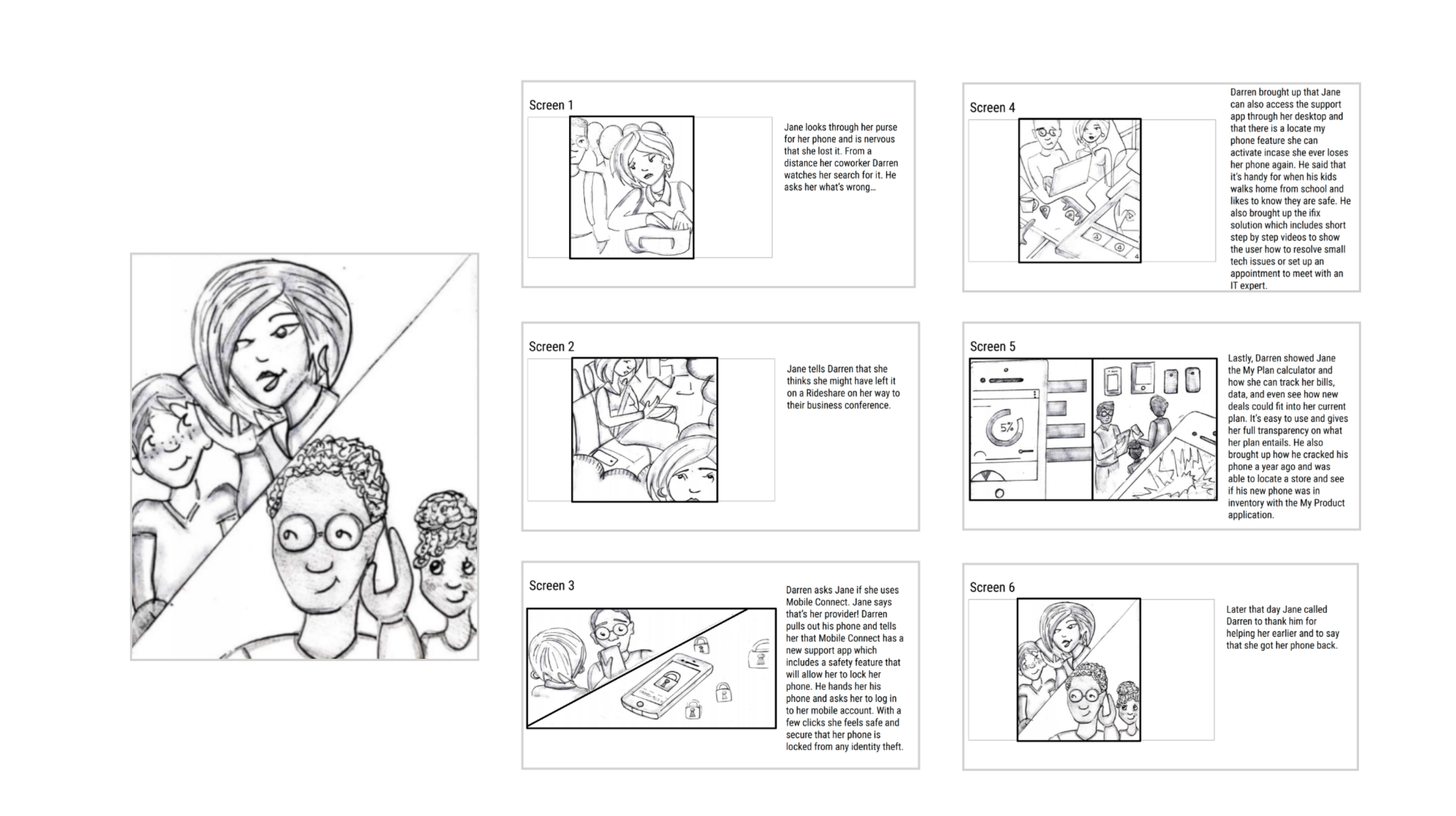
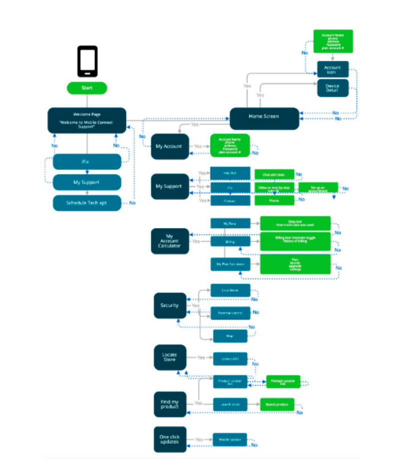
Once ideas were brainstormed, a storyboard was created along with the mapping on how the user would navigate the app keeping in mind both business and customer needs.
Developing the UI:
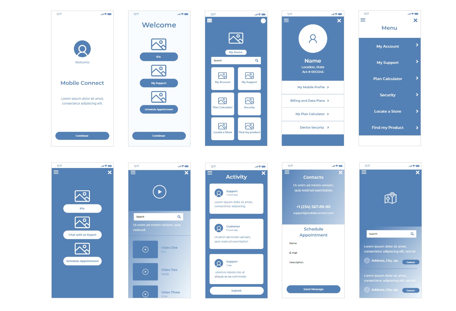
Please Click Here to View Low-Fidelity Wireframes
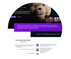
I researched different Mobile applications and discovered that aside from Apple and Google, most apps were not user-friendly. Several promoted plans focused on filling out accounts, before helping their customers with support. What made Apple stand out was that it was a stand-alone app that focused on quality support. This was one of the biggest problems the users faced in the interview. Using this information wireframes were created to create a Mobile Support Application.
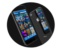
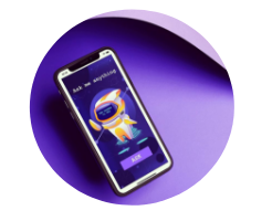
The Prototype
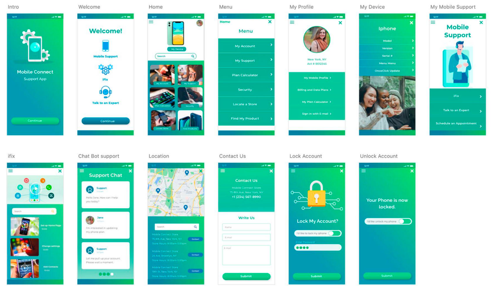
Please Click Here to View High-Fidelity Prototype
The final high-fidelity prototype includes the following features:
- A simple and direct Welcome page where the user can scan and click where they need assistance.
- A Homepage that offers visual cues on where to find support.
- The mobile support screen includes optional ifix or customer 24/7 support. There would be a location finder so that users can locate the nearest store in case they need in-person support.
- Appointments could quickly be made with one click on the store map. The security feature would allow customers to lock their phone from anywhere in case it becomes stolen or lost.
Result
Learnings:
We observed users navigating the prototype and some key discoveries were learned.
- There were mixed feelings on whether the users preferred images over icons as links.
- Users like having options when it comes to written instructions vs. tutorial videos.
- They want to feel extra safe when inputting passwords in an app. So It’s important to offer those features in a product.
- Users like clickable phone links.
- The image or icon should match the expectations on how users would describe the use of the link.
Outcome:
The look and feel of the app brand were popular among test participants. They liked how intuitive and easy it was to navigate the site. The app was designed to solve problems that were discovered during an interview. By creating a stand-alone support application, telecommunication companies can give their users the attention needed to provide the best overall user experience for their customers.